Web development is a process of creating a website or web application. It involves a wide range of disciplines, including web design, web engineering, web content development, client-side scripting, server-side scripting, and database management.
The process of web development can be divided into three stages: Planning, Development, and Deployment.
• Planning is all about gathering requirements and deciding on the overall goals of the project. Once the goals are defined, the next stage, development, can begin.
• Development is the stage where the actual website or web application is built. This includes coding, testing, and making sure everything works as it should.
• Deployment is when the website or web application is made available to the public. This usually involves putting it on a web server and making sure it is accessible to everyone.
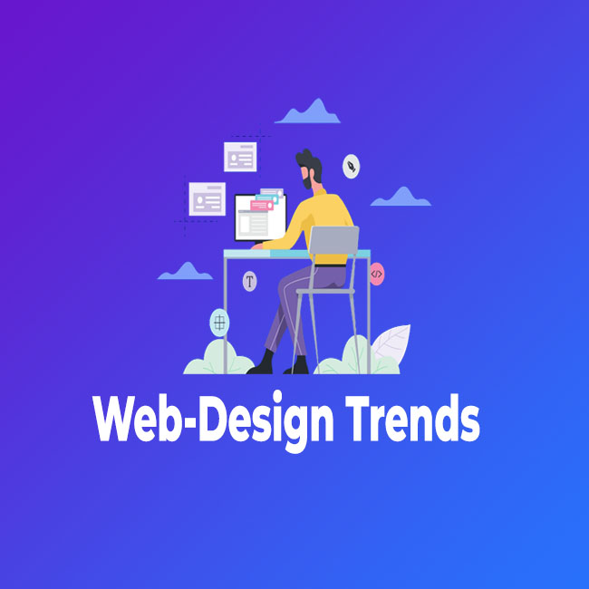
As we are in 2022, there are a number of web design trends that are worth keeping an eye on. In this blog post, we will take a look at the top web design trends for 2022.
Mobile-first design
In the world of web design, there are two main approaches to how a website is created: mobile-first and desktop-first. Mobile-first design is a newer method that starts with the design for mobile devices and then expands the design to other devices. Desktop-first design is the older method where the design starts with the desktop version and then is adapted for mobile devices.
There are several reasons why mobile-first design is becoming more popular. First, mobile devices are becoming more common and people are using them more often. Second, mobile devices have different screen sizes and shapes than desktop devices, so it is important to design specifically for them. Third, mobile devices are often used while people are on the go, so the design needs to be easy to use and understand.
There are also some disadvantages to using mobile-first design. First, not all websites need to be designed for mobile devices. Second, it can be more difficult to design a website for multiple devices if you start with the mobile design. Third, not all desktop features can be easily transferred to a mobile device.
Despite these disadvantages, mobile-first design is becoming more popular because it is a better way to design websites for the devices that people are using today.
Card-based design
Designing with cards is a popular way to create interfaces that are both efficient and easy to use. When done well, card-based design can make it easy for users to find the information they need and complete tasks.
There are a few things to keep in mind when designing with cards:
• Use cards to display small amounts of information: Cards are perfect for displaying small amounts of information. They can help users scan through content quickly and find the information they need.
• Use clear and concise titles: Titles are an important part of cards. They help users understand the content of the card and decide whether they need to read it. Make sure your titles are clear and concise.
• Use icons and images sparingly: Cards are already small, so adding too many icons and images can make them difficult to read. Use icons and images sparingly to avoid overcrowding the card.
• Use whitespace to create contrast: Whitespace can be used to create contrast between different elements on the card. This can help users focus on the most important information.
• Use arrows to indicate hierarchy: Arrows can be used to indicate hierarchy on cards. This can help users understand the relationships between different pieces of information.
Large background images
A big, beautiful background image is a great way to make a statement on your website. Just make sure that the rest of your design is simple and uncluttered, so the image can really shine.
Animation and video
Adding some animation or video to your website can make it more engaging and exciting for visitors. But use these elements sparingly, so they don’t become overwhelming or distracting.
Material design
Inspired by Google’s material design principles, this trend is all about creating a more intuitive and user-friendly web experience. Using simple, clean layouts and design elements, material design makes it easy
Dark mode
I'm a big fan of dark mode. I love how it makes everything look sleek and modern. I also like that it's easier on my eyes. I can see everything better in dark mode, and it's just generally more pleasant to look at.
I know a lot of people who don't like dark mode because it's harder to see things. But I think that's the whole point! It's easier to see things in dark mode if you're used to it. And if you're not used to it, then you just have to adjust a little bit.I think dark mode is a great way to improve your productivity. It's easier to focus in a dark environment, and it just makes everything look nicer. I highly recommend giving dark mode a try!
Personalization
Personalization is all about creating a custom experience for each user. This could involve using data to show relevant content, tailoring the design to the user’s preferences, or even just using their name throughout the site.
Typography
The use of typography can greatly affect the overall tone and readability of a text. It is important to choose the right fonts and typesetting to create a polished and professional look. Some basic principles of typography to keep in mind are to use a sans-serif font for body text, to use a different font for headings, and to set the text to a comfortable font size.
Additionally, it is important to use proper spacing between letters and words, and to align the text to the left margin.
Voice control
With the rise of smart speakers and voice-controlled assistant devices, it’s likely that more users will be using voice commands to control their web experience. This means your website needs to be designed for voice control, which could include adding voice search and navigation.
Fluid layouts
Web design has come a long way in the past few years. With the advent of responsive design, we can now create websites that adapt to the size of the screen they are being viewed on. This means that no matter what device you are using, the website will look good.One of the challenges of responsive design is creating fluid layouts.
This involves using percentage-based widths and heights, rather than fixed values. By doing this, we can ensure that the layout will always be proportional, regardless of the screen size.
There are a few tricks we can use to make creating fluid layouts a bit easier. First, we can use a CSS preprocessor such as Less or Sass to create mixins and variables. This will make it easier to change the values of our widths and heights.We can also use a layout grid to help us create our layout.
This will ensure that our columns are evenly spaced and that our content is always aligned correctly.By using these techniques, we can create fluid layouts that look great on any device.
Parallax scrolling
Parallax scrolling is a technique used in web design and video production that creates an illusion of depth by scrolling elements at different speeds. When used properly, parallax scrolling can make websites and videos more engaging and immersive. There are a few things to keep in mind when using parallax scrolling.
Bold colors
Bright, bold colors are another big trend for 2022. This is a great way to add personality to your site and make it stand out from the crowd.
Thank you for reading! We hope this information has helped you, but if you are still confused. Connect with our team of professionals offering Web Development Services to grow your business.